On Monday, I came down with flu (better now) and was issued a 5-day MC. Stuck at home, I thought it would be interesting to explore data on Singapore’s COVID-19 cases to see what insights could be drawn. This post contains some exploratory data analysis (EDA) on data from the Gov.sg COVID-19 Dashboard and the Against COVID-19 Singapore Dashboard.
TL;DR
The key observations:
- The age group with the most cases is the 20-to-30 group.
- There are more males (59%) than females (41%) infected with COVID-19.
- Currently, there are more imported (54%) than local (46%) cases.
- Most cases came from a single destination before contracting COVID-19.
- About half of all cases had a hospital stay of 11 days.
- Singapore citizens make up a majority (60%) of the cases.
- About 73% of cases are still in hospital, while a good 27% of cases have been discharged.
- Approximately 58% (695 of 1189) of cases had no link to known cases.
- Of those who received the virus from at least one person (291), 70% (204) did not transmit the virus further, while 20% (56) transmitted to only one other person.
- If we consider only cases that have reached some conclusion (recovery/death), the recovery rate is 98%. GO HEALTHCARE WORKERS.
We couldn’t predict discharges well, possibly because:
- There was insufficient data. We did not have enough personal medical data.
- There will always be insufficient data. Data will not be generated fast enough for us to have a workable sample size because (a) the time from infection to discharge/death is rather long and (b) our population is just too small.
- Changing relationship between predictors and outcomes. As hospitals become more capable and the government introduces more enhanced measures to combat COVID-19, the relationships in the data will change over time.
The Data
As mentioned earlier, we use data from the Gov.sg COVID-19 Dashboard and the Against COVID-19 Singapore Dashboard.
Gov.sg COVID-19 Dashboard
We extract data from this page, the actual dashboard on ArcGIS, and perform some basic data cleaning.
# Load data
with open('sg_covid19_raw.txt') as json_file:
    cv_json = json.load(json_file)

# Extract attributes
raw_data = [x['attributes'] for x in cv_json]

# Convert to data frame
df = pd.DataFrame(raw_data)

# Configure columns to drop
drop_cols = ['CASE_NEGTV', 'LAT', 'LONG', 'DT_CAS_TOT', 'POST_CODE', 'TOT_COUNT', 'CASE_PENDG', 'ObjectId', 'Case_Count', 'CNFRM_CLR', 'Case_total', 'Confirmed', 'DEATH', 'DISCHARGE', 'Date_of_Di', 'PLAC_VISTD', 'RESPOSTCOD', 'RES_LOC', 'Suspct_Cas', 'Tot_ICU', 'Tot_Impotd', 'Tot_NonICU', 'Tot_local', 'UPD_AS_AT']

# Drop columns
df = df.drop(drop_cols, axis=1)

# Extract date
df['date'] = df.apply(lambda x: str(datetime.datetime.fromtimestamp(x.Date_of_Co/1000).date()), axis=1)

# Convert to date
df['date'] = pd.to_datetime(df.date)

# Compute date since identified
df['days'] = (pd.to_datetime('2020-04-07') - df.date).dt.days

# Drop old date
df = df.drop('Date_of_Co', axis=1)

# Display data
display(df.head())
| Age | Case_ID | Cluster | Current_Lo | Gender | Imported_o | Nationalit | PHI | Place | PlanningAr | Prs_rl_URL | Region_201 | Status | date | days |
|---|---|---|---|---|---|---|---|---|---|---|---|---|---|---|
| 15 | 1189 | 0 | KTPH | F | Local | Singapore Citizen | 0 | Singapore | 0 | https://www.moh.gov.sg/news-highlights/details... | 0 | Hospitalised | 2020-04-04 | 3 |
| 54 | 1188 | 0 | KTPH | M | Local | Singapore Citizen | 0 | Singapore | 0 | https://www.moh.gov.sg/news-highlights/details... | 0 | Hospitalised | 2020-04-04 | 3 |
| 25 | 1187 | 0 | KTPH | M | Local | Bangladeshi (Singapore Work Pass holder) | 0 | Singapore | 0 | https://www.moh.gov.sg/news-highlights/details... | 0 | Hospitalised | 2020-04-04 | 3 |
| 32 | 1186 | 0 | NCID | M | Local | Bangladeshi (Long Term Pass holder) | 0 | Singapore | 0 | https://www.moh.gov.sg/news-highlights/details... | 0 | Hospitalised | 2020-04-04 | 3 |
| 18 | 1185 | 0 | NCID | M | Local | Indian (Long Term Pass holder) | 0 | Singapore | 0 | https://www.moh.gov.sg/news-highlights/details... | 0 | Hospitalised | 2020-04-04 | 3 |
Against COVID-19 Dashboard
There wasn’t a quick and easy way to extract the data from this website. Hence, I downloaded the data page by page into 12 CSV files.
# Get file list
filelist = os.listdir('Against COVID-19')

# Create dataframe
df2 = pd.DataFrame()
for f in filelist:
    df2 = df2.append(pd.read_csv('Against COVID-19/' + f))

# Remove null entries
df2['Recovered At'] = df2['Recovered At'].str.replace('-', '')

# Convert to date
df2['Recovered At'] = pd.to_datetime(df2['Recovered At'])
There was also a network graph indicating the linkages between cases. From this, we extract:
rx: The number of people that each case possibly received the virus fromtx: The number of people that each case possibly transmitted the virus toCluster X: The various clusters as identified by MOH
# Load graph data
with open('Against COVID-19/network_graph.json') as json_file:
    graph = json.load(json_file)

# Convert to data frame
nodes = pd.DataFrame(graph['nodes'])
edges = pd.DataFrame(graph['edges'])

# Drop unused
nodes = nodes.drop(['borderWidth', 'color', 'shape', 'size', 'x', 'y'], axis=1)
edges = edges.drop(['arrows', 'color', 'dashes', 'font'], axis=1)

# Partition datasets into clusters and nodes
case_clusters = nodes[nodes.id.str.contains('Cluster')]
case_nodes = nodes[~nodes.id.str.contains('Cluster')]

# Extract case ID
case_nodes['label'] = pd.to_numeric(case_nodes.label.str.replace('Case ', '').str.replace(' .*', ''))

# Map case ID
edges['case_id_from'] = edges['from'].map(case_nodes[['label', 'id']].set_index('id').to_dict()['label']).fillna(0).astype(int)
edges['case_id_to'] = edges['to'].map(case_nodes[['label', 'id']].set_index('id').to_dict()['label']).fillna(0).astype(int)

# List of clusters
clusters = sorted(case_clusters.id.unique())

# Initialise features
df2['rx'] = 0
df2['tx'] = 0

for clust in clusters:
    df2[clust] = 0

# Extract features
for case in tqdm(df2.Case):

    # Pull data
    temp_dat = edges[(edges.case_id_to == case) | (edges.case_id_from == case)]

    # Received
    df2['rx'].loc[df2.Case == case] = temp_dat[(temp_dat['from'].str.contains('Case')) & (temp_dat.case_id_to == case)].shape[0]

    # Transmitted
    df2['tx'].loc[df2.Case == case] = temp_dat[(temp_dat['to'].str.contains('Case')) & (temp_dat.case_id_from == case)].shape[0]

    # Extract clusters
    temp_clust = temp_dat['from'].loc[temp_dat['from'].str.contains('Cluster')].to_list() + temp_dat['to'].loc[temp_dat['to'].str.contains('Cluster')].to_list()

    if len(temp_clust) > 0:
        df2.loc[df2.Case == case, temp_clust] = 1

# Count number of clusters
df2['n_clusters'] = df2[clusters].sum(axis=1)

# Save
df2.to_csv('against_covid_clean.csv', index=False)

# Load
df2 = pd.read_csv('against_covid_clean.csv')
df2['Recovered At'] = pd.to_datetime(df2['Recovered At'])
Data Cleaning
First, we merge the datasets. I was particularly interested in the date that cases recovered (Recovered At) and the network features created above, since these were lacking in the Gov.sg dataset.
# Merge
df = df.merge(df2[['Case', 'Patient', 'Recovered At', 'tx', 'rx', 'n_clusters'] + clusters], how='left', left_on='Case_ID', right_on='Case')

# Update case status
df['Status'].loc[df['Recovered At'].notnull()] = 'Discharged'
Next, we clean up the string features and create binary variables for each country that each individual visited prior to contracting COVID-19. We also create three features:
n_sources: Number of countries that the individual visited.day_year: Day of the year that the individual was identified as a case.days: No. of days that the individual spent in hospital. The start date was always the date that the individual was identified as a case. If the individual is still hospitalised, we used today’s date as the end date. If the individual was discharged, we used the recovery date as the end date.
# Gender
df['Gender'] = df.Gender.str.strip().str.lower()

# Nationality
df['nationality'] = df.Nationalit.str.replace('\(.*\)', '').str.strip().str.lower()
df['nationality'].loc[df.nationality == 'india'] = 'indian'
df['nationality'].loc[df.nationality == 'switzerland'] = 'swiss'
df['nationality'].loc[df.nationality == 'myanmar'] = 'burmese'
df['nationality'].loc[df.nationality == 'uk'] = 'british'

# Place
df['Place'].loc[df.Place=='0'] = 'Unknown'
df['Place'] = df.Place.str.replace('United Arab Emirates', 'UAE')
df['Place'] = df.Place.str.replace('Sri Lanka', 'srilanka')
df['Place'] = df.Place.str.replace('South Africa', 'southafrica')
df['Place'] = df.Place.str.replace('Czech Republic', 'czechrepublic')
df['Place'] = df.Place.str.replace('Eastern Europe', 'europe')
df['Place'] = df.Place.str.replace('Moscow', '')
df['Place'] = df.Place.str.replace('Copenhagen', '')
df['Place'] = df.Place.str.replace('London', 'uk')

# Create dummy variables for each location
# Initialised and fit TF-IDF Vectorizer
tf = CountVectorizer()
tf.fit(df.Place)

# Create data frame of source
source_df = pd.DataFrame(tf.transform(df.Place).toarray(), columns=['from_' + x for x in tf.get_feature_names()])
for col in source_df:
    source_df[col] = source_df[col].astype(int)

# Merge
df = pd.concat([df, source_df], axis=1)

# Add column
df['n_sources'] = source_df.sum(axis=1)

# Days since 1st Jan
df['day_year'] = (df['date'] - pd.to_datetime('2020-01-01')).dt.days

# No. of days in hospital
df['days'].loc[df['Recovered At'].notnull()] = (df['Recovered At'].loc[df['Recovered At'].notnull()] - df['date'].loc[df['Recovered At'].notnull()]).dt.days

# Fill missing
df[clusters] = df[clusters].fillna(0)
df['rx'] = df.rx.fillna(0)
df['tx'] = df.tx.fillna(0)
df['n_clusters'] = df.n_clusters.fillna(0)
Exploratory Data Analysis
Now, we dive into exploratory data analysis (EDA), first for individual features, and then for the relationship between status (discharged/deceased/hospitalised) and individual features.
Individual Features
In this section, we visualise the key features in the dataset. I omitted location (town/planning area) data because a majority of the data was missing (~67%). I also omitted data on the hospitals that cases were treated/held at because I didn’t think it would be fair to compare the discharge/death rates among the various hospitals. There is too much randomness in the kind of cases that get resolved.
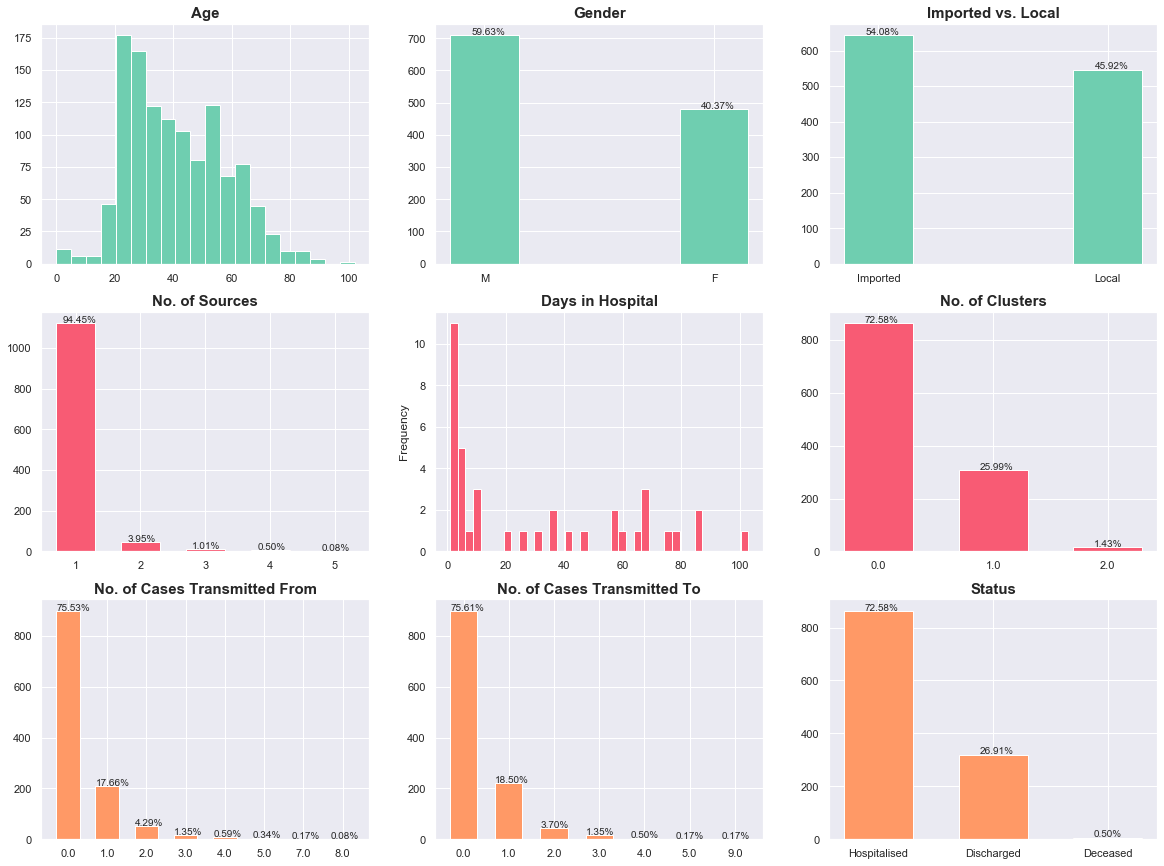
Here are the key observations, summarised:
- Age: The age group with the most cases is the 20-to-30 group.
- Gender: There are more males (59%) than females (41%) infected with COVID-19.
- Imported/Local: Currently, there are more imported (54%) than local (46%) cases.
- Sources: Most cases came from a single destination before contracting COVID-19.
- Days in Hospital: About half of all cases had a hospital stay of 11 days.
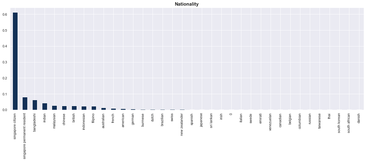
- Nationality: Singapore citizens make up a majority (60%) of the cases.
- Linkages: The data suggests that most people did not receive or transmit the virus from anyone. This requires some investigation.
- Outcomes:
- About 73% of cases are still in hospital, while a good 27% of cases have been discharged.
- If we consider only cases that have reached some conclusion (recovery/death), the recovery rate is 98%. That’s 320 of 326 cases. GO HEALTHCARE WORKERS.
Transmissions
The transmission data is quite interesting. Here are some observations:
- Approximately 58% (695 of 1189) of the cases had no link to known cases.
- Of those who received the virus from at least one person (291), 70% (204) did not transmit the virus further, while 20% (56) transmitted to only one other person.
# Two-way table
txrx = pd.crosstab(df.rx, df.tx, margins=True)
display(txrx)
| tx | 0.0 | 1.0 | 2.0 | 3.0 | 4.0 | 5.0 | 9.0 | All |
|---|---|---|---|---|---|---|---|---|
| rx | ||||||||
| 0.0 | 695 | 164 | 25 | 10 | 4 | 0 | 0 | 898 |
| 1.0 | 153 | 36 | 11 | 6 | 2 | 1 | 1 | 210 |
| 2.0 | 30 | 14 | 6 | 0 | 0 | 0 | 1 | 51 |
| 3.0 | 10 | 5 | 1 | 0 | 0 | 0 | 0 | 16 |
| 4.0 | 5 | 1 | 0 | 0 | 0 | 1 | 0 | 7 |
| 5.0 | 4 | 0 | 0 | 0 | 0 | 0 | 0 | 4 |
| 7.0 | 1 | 0 | 1 | 0 | 0 | 0 | 0 | 2 |
| 8.0 | 1 | 0 | 0 | 0 | 0 | 0 | 0 | 1 |
| All | 899 | 220 | 44 | 16 | 6 | 2 | 2 | 1189 |
The data shows that the government’s enhanced measures to combat COVID-19 appear to be working based on the no-transmission rate over time. This rate measures the percentage of people who did not transmit COVID-19 after contracting it.
# Get no-transmission frequencies over time
freqs = []
impts = []

for i in df.date.unique():
    temp_df = df[df.date <= i]
    freqs.append(np.mean(temp_df.tx.loc[temp_df.rx > 0] == 0))
    impts.append(np.mean(temp_df.Imported_o == 'Imported'))

# Convert to data frame
freq_ts = pd.DataFrame({'date': df.date.unique(), 'tx_pct': freqs, 'imported': impts})
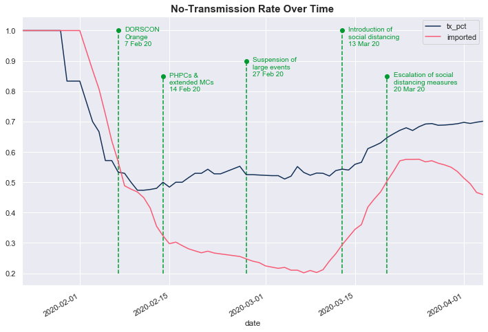
Initially, the no-transmission rate (dark blue line, tx_pct) was high because cases were primarily imported (red line). Subsequently, the no-transmission rate fell alongside the number of imported cases, indicating that local transmissions rose. The no-transmission rate dropped below 50% shortly after DORSCON was raised to Orange on 7 Feb 20. Thereafter, the no-transmission rate has risen steadily as the government introduced enhanced precautionary measures.
Relationship Between Status and Individual Features
Next, we breakdown the distribution of each individual feature by the case status (Hospitalised/Discharged/Deceased). Note that there were only 6 deaths, so the statistics and observations on this group may not generalise well.
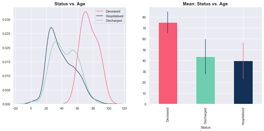
Status vs. Age
Thus far, most of the people who passed on due to COVID-19 were older on average (and the data was relatively tightly grouped around this mean). Meanwhile, there wasn’t a big difference between the distribution of age for those currently hospitalised and those who were discharged.
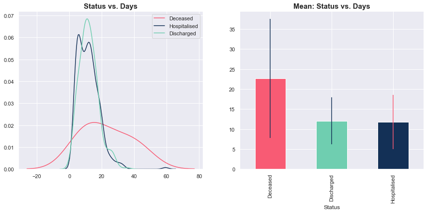
Status vs. Days
Unlike Age, there was no clear pattern for the number of days spent in hospital. On average, deceased cases spent more time in hospital, but the variance was high. Meanwhile, there was no discernible difference in the distributions of days spent in hospital for those currently hospitalised and those who were discharged.
Status vs. Gender
4 of the 6 (66%) deceased cases were male. Once again, there was no distinct difference in gender proportions for the hospitalised and discharged groups. Refer to the table below the graph for the actual numbers.
# Create dummy variable for males
df['male'] = (df.Gender == 'm').astype(int)
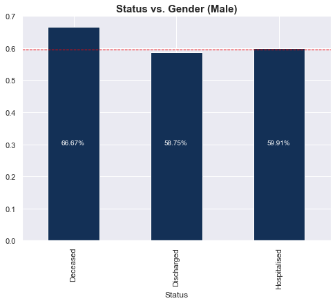
| Status | Deceased | Discharged | Hospitalised |
|---|---|---|---|
| Gender | |||
| f | 2 | 132 | 346 |
| m | 4 | 188 | 517 |
Status vs. Imported/Local
4 of the 6 (66%) deceased cases were local. There wasn’t a big difference in proportion of locals for the hospitalised and discharged groups. Refer to the table below the graph for the actual numbers.
# Create dummy variable for males
df['local'] = (df.Imported_o == 'Local').astype(int)
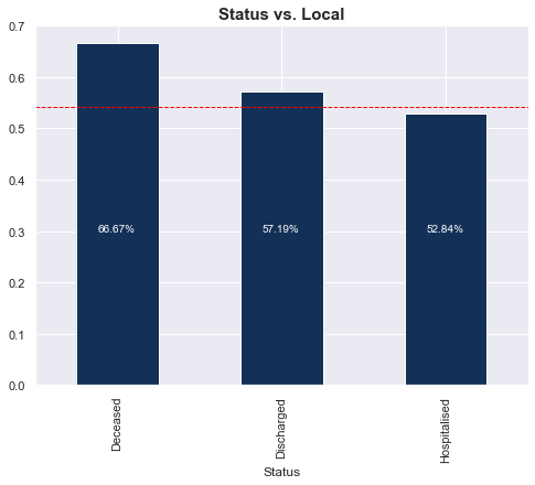
| Status | Deceased | Discharged | Hospitalised |
|---|---|---|---|
| local | |||
| 0 | 2 | 137 | 407 |
| 1 | 4 | 183 | 456 |
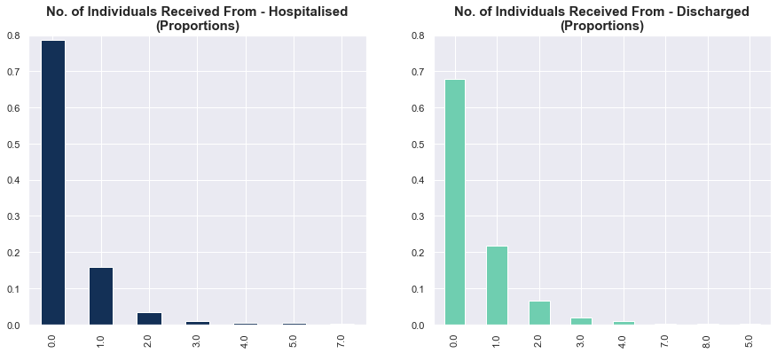
Status vs. No. of Cases That Individuals Contracted COVID-19 From
Here, we examine the proportions of those hospitalised and discharged who contacted X cases. Strangely, the discharged cases had stronger linkages to past cases. But overall, there is probably no relation between the number of prior cases contacted and status.
# Compute proportions
rx_disc = df.rx.loc[df.Status=='Discharged'].value_counts() / df.rx.loc[df.Status=='Discharged'].shape[0]
rx_hosp = df.rx.loc[df.Status=='Hospitalised'].value_counts() / df.rx.loc[df.Status=='Hospitalised'].shape[0]
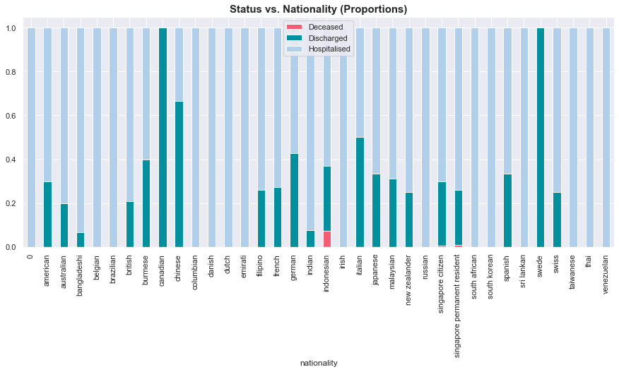
Status vs. Nationality
The graph below plots the proportions of individuals from each nationality who were hospitalised/discharged/deceased. For quick reference, the teal bars represent discharged cases, red represents deceased cases, and light blue represents hospitalised cases. With such small samples within each nationality, we can’t draw any meaningful conclusions from this.
# Cross-tabulate data
stat_nat = pd.crosstab(df.Status, df.nationality).T

# Compute proportions
stat_nat['totals'] = stat_nat.sum(axis=1)
stat_nat['Deceased'] = stat_nat.Deceased / stat_nat.totals
stat_nat['Discharged'] = stat_nat.Discharged / stat_nat.totals
stat_nat['Hospitalised'] = stat_nat.Hospitalised / stat_nat.totals

# Drop totals
stat_nat = stat_nat.drop('totals', axis=1)
Factors for Discharge
Finally, we try our luck to model the factors contributing to discharge. Our target is a binary feature for discharged vs. not discharged yesterday, 08 Apr 2020. I should probably state upfront that there are severe limitations from modelling cases that will be discharged in this manner. This is because (a) most cases have not concluded yet, and (b) we are effectively ignoring deaths by lumping it with hospitalised cases. Let’s see what we get anyway, without any high hopes.
df['Recovered At'] = df['Recovered At'].fillna(pd.to_datetime('2020-04-08'))

df['prior_disc'] = 0
for i in df.date.unique():
    df['prior_disc'].loc[df.date==i] = df[(df['Recovered At'] < i)].shape[0]
Statistical Results
In our logistic regression model, we include the following features:
- Age
- Gender (male)
- Source (local)
- Number of sources
- Day of the year
- An interaction variable between age and source (local)
- An interaction variable between age and gender (male)
- Cases contacted (receipt of COVID-19)
- Cases contacted (transmission of COVID-19)
- Number of clusters contacted
# Prepare data
X_dat = pd.get_dummies(df[['Age', 'male', 'local', 'n_sources', 'day_year', 'rx', 'tx', 'n_clusters']])
X_dat['const'] = 1.0
y_dat = (df.Status == 'Discharged').astype(int)

# Create interactions
X_dat['age_local'] = X_dat.Age * X_dat.local
X_dat['age_male'] = X_dat.Age * X_dat.male

# Fit model
logreg = Logit(y_dat, X_dat)
logreg_fitted = logreg.fit(maxiter=10000)

# Print summary
print(logreg_fitted.summary())
Optimization terminated successfully.
         Current function value: 0.350936
         Iterations 7
                           Logit Regression Results
==============================================================================
Dep. Variable:                 Status   No. Observations:                 1189
Model:                          Logit   Df Residuals:                     1178
Method:                           MLE   Df Model:                           10
Date:                Thu, 09 Apr 2020   Pseudo R-squ.:                  0.3974
Time:                        11:19:42   Log-Likelihood:                -417.26
converged:                       True   LL-Null:                       -692.47
Covariance Type:            nonrobust   LLR p-value:                7.323e-112
==============================================================================
                 coef    std err          z      P>|z|      [0.025      0.975]
------------------------------------------------------------------------------
Age            0.0094      0.010      0.976      0.329      -0.009       0.028
male           0.9801      0.477      2.055      0.040       0.045       1.915
local          0.0140      0.521      0.027      0.979      -1.008       1.036
n_sources     -0.0052      0.198     -0.026      0.979      -0.393       0.383
day_year      -0.1834      0.013    -13.592      0.000      -0.210      -0.157
rx            -0.1402      0.114     -1.232      0.218      -0.363       0.083
tx             0.0565      0.125      0.453      0.650      -0.188       0.301
n_clusters    -0.3783      0.256     -1.478      0.139      -0.880       0.123
const         13.0321      1.201     10.847      0.000      10.677      15.387
age_local      0.0056      0.011      0.512      0.608      -0.016       0.027
age_male      -0.0224      0.011     -2.116      0.034      -0.043      -0.002
==============================================================================
As shown above, the significant features were gender (male), the day of the year, the interaction term between age and gender (male), and a constant. The coefficients above capture the impact of each feature on log odds. To see the impact on probabilities, we use the marginal effects table below:
# Print marginal effects
display(logreg_fitted.get_margeff().summary())
| Dep. Variable: | Status |
|---|---|
| Method: | dydx |
| At: | overall |
| dy/dx | std err | z | P>|z| | [0.025 | 0.975] | |
|---|---|---|---|---|---|---|
| Age | 0.0010 | 0.001 | 0.978 | 0.328 | -0.001 | 0.003 |
| male | 0.1062 | 0.051 | 2.067 | 0.039 | 0.005 | 0.207 |
| local | 0.0015 | 0.056 | 0.027 | 0.979 | -0.109 | 0.112 |
| n_sources | -0.0006 | 0.021 | -0.026 | 0.979 | -0.043 | 0.041 |
| day_year | -0.0199 | 0.001 | -18.321 | 0.000 | -0.022 | -0.018 |
| rx | -0.0152 | 0.012 | -1.234 | 0.217 | -0.039 | 0.009 |
| tx | 0.0061 | 0.014 | 0.453 | 0.650 | -0.020 | 0.033 |
| n_clusters | -0.0410 | 0.028 | -1.477 | 0.140 | -0.095 | 0.013 |
| age_local | 0.0006 | 0.001 | 0.513 | 0.608 | -0.002 | 0.003 |
| age_male | -0.0024 | 0.001 | -2.128 | 0.033 | -0.005 | -0.000 |
To loosely interpret the marginal effects, on average (and ceteris paribus)…
- Males appear to have a 10% higher probability of getting discharged
- For males, the relationship between age and the probability of getting discharged is more negative than that of females, by 0.2%
- Individuals who were identified earlier seem to have a 2% lower probability of getting discharged
Model-Agnostic Interpretation
Next, we dive into some (explainable) machine learning (ML) by computing Shapley values to understand the broad impact of the features on the probability of getting discharged at the local (each sample) and global (across all samples) levels. The Shapley value is the average of all marginal contributions of a feature to all possible coalitions (of feature values). See Google’s Explainable AI white paper for a more detailed explanation.
We re-estimate the logistic regression model with the sklearn module. We leave all features in, even the statistically insignificant ones, since we care more about predictive power for the rest of this section.
# Prepare data
X_dat = pd.get_dummies(df[['Age', 'male', 'local', 'n_sources', 'day_year', 'rx', 'tx', 'n_clusters']])
X_dat['age_local'] = X_dat.Age * X_dat.local
X_dat['age_male'] = X_dat.Age * X_dat.male
y_dat = (df.Status == 'Discharged').astype(int)

# Initialise model
logreg = LogisticRegression(max_iter=1000, solver='saga', n_jobs=4)

# Fit and predict
logreg.fit(X_dat, y_dat)
preds = logreg.predict(X_dat)

# Plot Shapley values
shap_log = shap.LinearExplainer(logreg, X_dat).shap_values(X_dat)
shap.summary_plot(shap_log, X_dat, plot_size=(15, 10))
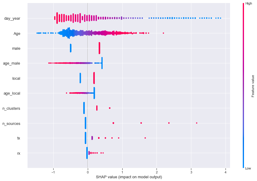
In the diagram above, each value (dots) of each feature (rows) is plotted. High values of each feature are in red, while the low values are in blue. As an example, let’s look at Age.
- High values (in red) lie on the right side of the scale, implying a positive impact on the probability of getting discharged
- Meanwhile, low values (in blue) lie on the left side of the scale, implying a negative impact on the probability of getting discharged
- Together, this means a positive correlation between age and getting discharged, which matches our findings above
- In English: the older you are, the higher the chance of getting discharged
Another example would be the day of the year:
- High values (in red) lie on the left, implying a negative impact on the probability of getting discharged
- Low values (in blue) lie on the right, implying a positive impact on the probability of getting discharged
- Together, this means a negative relationship between the date you were identified as a confirmed case and getting discharged, which matches our findings above
- In English: the earlier you were identified as a COVID-19 case (which means the longer you’ve been in hospital as of yesterday), the lower the probability of getting discharged
Inspection of Predictions
Another important step in model evaluation is inspecting predictions to see if our predictions make sense. If this were an ML project, I would have done this first, in addition to computing standard classification metrics like precision, recall, and Area Under Curve (AUC). After all, ML cares more about whether you shoot accurately, regardless of technique, while statistics cares more about whether you held the gun and pulled the trigger using the proper technique.
# Copy data
high_prob_df = df[['Case_ID', 'Age', 'Gender', 'Nationalit', 'Status']].copy()

# Insert predicted probabilities
high_prob_df['prob'] = logreg.predict_proba(X_dat)[:, 1]

# Inspect predictions
display(high_prob_df.sort_values('prob', ascending=False)[high_prob_df.Status!='Discharged'].head(20))
| Case_ID | Age | Gender | Nationalit | Status | prob |
|---|---|---|---|---|---|
| 270 | 62 | f | Singapore Citizen | Hospitalised | 0.944303 |
| 113 | 42 | m | French (Singapore Work Pass Holder) | Hospitalised | 0.884593 |
| 42 | 39 | m | Bangladeshi (Singapore Work Pass Holder) | Hospitalised | 0.873572 |
| 41 | 71 | m | Singapore Citizen | Hospitalised | 0.866461 |
| 35 | 64 | m | Singapore Citizen | Hospitalised | 0.841244 |
| 90 | 75 | f | Singapore Citizen | Deceased | 0.823856 |
| 193 | 26 | m | Malaysian (Singapore Work Pass Holder) | Hospitalised | 0.790345 |
| 918 | 86 | f | Singapore Citizen | Deceased | 0.763554 |
| 142 | 26 | m | Singapore Citizen | Hospitalised | 0.701128 |
| 327 | 38 | f | Singapore Citizen | Hospitalised | 0.684862 |
| 194 | 24 | f | Chinese (Singapore Work Pass Holder) | Hospitalised | 0.675249 |
| 1121 | 66 | m | Singapore Citizen | Hospitalised | 0.662945 |
| 129 | 68 | f | Singapore Citizen | Hospitalised | 0.646263 |
| 127 | 64 | f | Singapore Citizen | Hospitalised | 0.635778 |
| 128 | 70 | m | Singapore Citizen | Hospitalised | 0.619108 |
| 130 | 66 | m | Singapore Citizen | Hospitalised | 0.594735 |
| 120 | 62 | f | Singapore Citizen | Hospitalised | 0.592831 |
| 161 | 73 | m | Singapore Citizen | Hospitalised | 0.564577 |
| 328 | 63 | f | Singapore Permanent Resident | Hospitalised | 0.563402 |
| 182 | 76 | f | Indonesian | Hospitalised | 0.562031 |
Above, I list the top 20 cases that we got wrong, ordered by the predicted probability of being discharged. A big problem: two of the four deceased cases appeared here. In fact, one of them had a predicted discharge probability of 82%!
# Latest discharged cases
display(high_prob_df[high_prob_df.Case_ID.isin([1167, 1076, 1038, 1032, 1020, 1004])])
| Case_ID | Age | Gender | Nationalit | Status | prob |
|---|---|---|---|---|---|
| 1167 | 58 | f | Singapore Citizen | Hospitalised | 0.121341 |
| 1076 | 54 | m | Singapore Permanent Resident | Hospitalised | 0.148745 |
| 1038 | 52 | f | Singapore Citizen | Hospitalised | 0.110903 |
| 1032 | 28 | f | Chinese (Singapore Work Pass holder) | Hospitalised | 0.071548 |
| 1020 | 45 | m | Bangladeshi (Long Term Pass holder) | Hospitalised | 0.138252 |
| 1004 | 32 | f | Indian (Singapore Work Pass holder) | Hospitalised | 0.099359 |
As a second check, I picked out the latest cases that were discharged (above). All of them were predicted for discharge with a probability of 15% or lower. These results should make you suspicious of everything we’ve learned from the models above.
Model Limitations
Overall, the model was simply bad. There are several possible reasons why:
There was insufficient personal data
Besides gender, age, and nationality, no other personal data was provided (yay PDPA!). This is a major factor. A person’s time to recovery (or even the possibility of recovery) depends on his/her current health, any existing medical conditions, and maybe genes. A epidemiologist could probably list more important factors.
There will always be insufficient data
Even if we had a lot of data on personal characteristics, we still need a large sample size. However, data will not be generated fast enough. This is because (a) the time from infection to discharge/death is rather long and (b) our population is just too small.
Regime change
This refers to the changing relationship between the predictors (i.e. personal data) and the outcome (recovery/death). As our hospitals become better equipped and able to fight COVID-19, we could see, for example, a decrease in the number of days spent in hospital, or fewer deaths. As the government introduces more measures, the local transmission rate could decrease further.
Conclusion
In this post, we explored data on COVID-19 cases in Singapore from the Gov.sg COVID-19 Dashboard and the Against COVID-19 Singapore Dashboard. While we made some general observations about age, gender, source, nationality, days in hospital, transmission, and outcome (hospitalised/deceased/discharged), we could not model the outcomes well. This was expected, and probably was because we didn’t (and won’t) have enough data.
The most impactful finding for me was the 98% (320 of 326) rate. Our healthcare workers are working themselves to the bone, and the results are clear. To everyone on the frontline in our fight against COVID-19: Stay strong - the nation is behind you! To everyone else: Stay healthy and safe.